

Completely free — the live pie, the carbon-intensity readout, the 24-hour trend and the by-generator breakdowns. No sign-up, no ads, no catch.
Runs entirely in your browser and updates on its own. Great on a second screen.
What GridMonkey shows
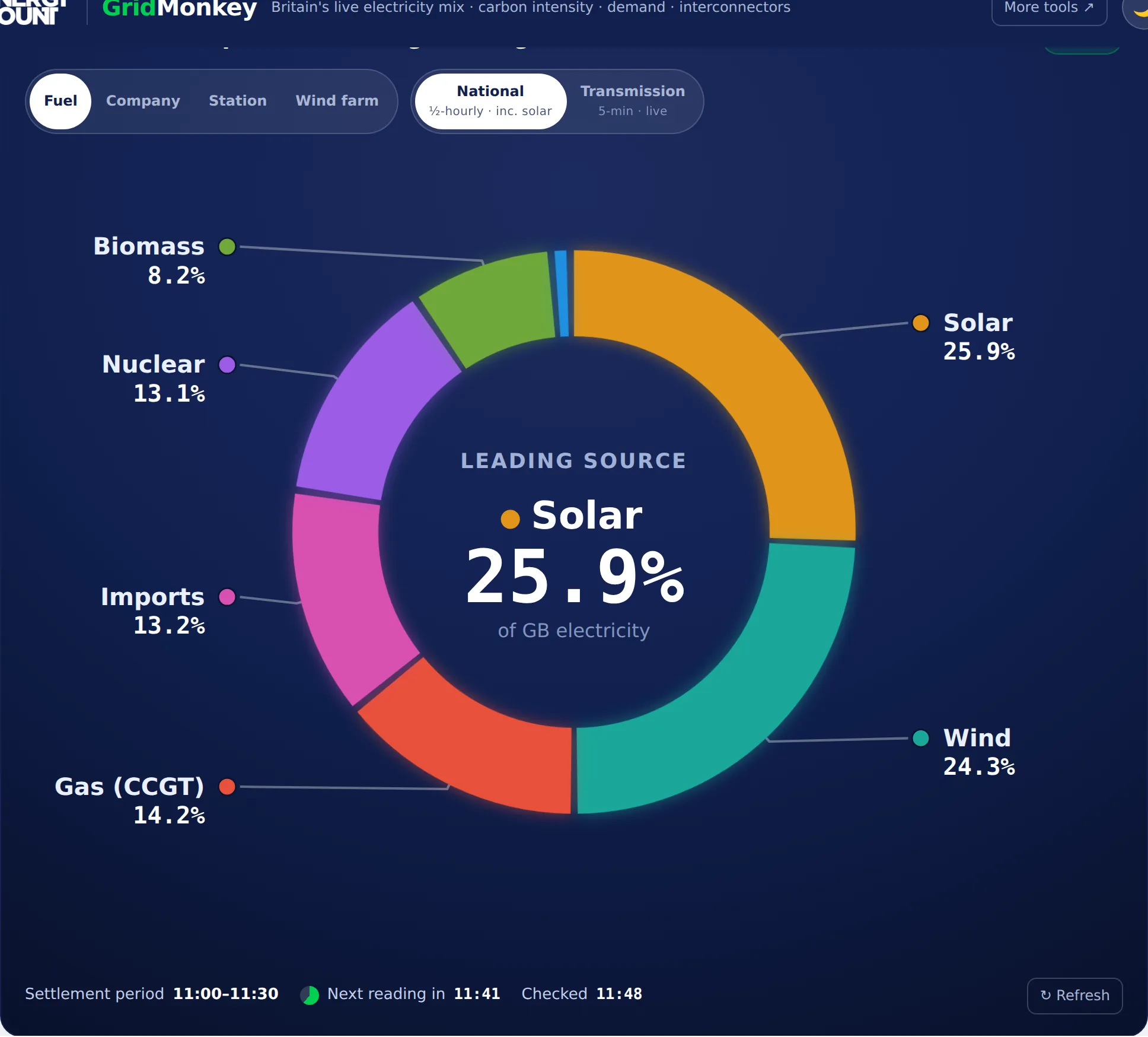
One glance tells you how Britain is powering itself right now. The big pie is the live generation mix — wind, solar, gas (CCGT), nuclear, biomass, hydro, imports and the rest — with each slice labelled by its share and its output in gigawatts. Around it sit live tiles for carbon intensity (the grams of CO₂ behind every kilowatt-hour), national demand, and the net flow across the interconnectors that link Britain to France, the Netherlands, Belgium, Norway, Denmark and Ireland — each cable broken out so you can see who we're importing from or exporting to. A 24-hour trend lets you flip between carbon intensity, demand, wind, solar, gas, nuclear and low-carbon share to see how the day has unfolded.
How live is it?
The generation mix updates every half hour. That isn't a shortcut — Britain's true national mix includes the solar power made on rooftops and in fields, which is measured indirectly and published once per half-hour settlement period. The fastest public feed refreshes every 5 minutes, but it only covers large transmission-connected stations (so it leaves out solar). GridMonkey uses the half-hourly national mix for the headline pie, and the 5-minute feed for demand, interconnector flows and the by-generator views — so it's about as close to real time as public GB grid data gets.
Group the pie your way
Beyond fuel, GridMonkey can regroup the same live output to answer different questions:
- By company & power station. Who's actually generating right now — Drax, Sizewell B, the big gas stations — from live per-unit data joined to Elexon's BM Unit register.
- By wind farm. Every transmission-connected wind farm with output right now — London Array, Hornsea, Dogger Bank, Seagreen and more — with how hard each is running versus its capacity.
- By owner. Roll the wind farms up to their parent — Ørsted, SSE, RWE, ScottishPower, Ocean Winds — to see who owns the wind turning right now.
Where the data comes from
GridMonkey reads two official, free feeds live: National Grid ESO's Carbon Intensity API for the national mix and carbon figure, and Elexon for 5-minute demand, interconnector flows and per-generator output. Figures are for Great Britain (they exclude Northern Ireland), and percentages are of electricity generated, not demand. It's a free companion to our other building-energy tools — if you assess or design low-carbon buildings, you might also want our free U-value calculator or the rest of the Monkey tools. Curious how the grid is decarbonising? Our guides on solar PV, renewable technologies and the Future Homes Standard put it in context.
Put GridMonkey on your site
It's free to embed. Drop this into any page and it'll show Britain's live grid mix, updating on its own — a great fit for an energy blog, a school page or a dashboard. A link back to GridMonkey is appreciated (the embed includes one).
Questions, answered
Where does GridMonkey's data come from?
Two official, free sources. The headline generation mix and carbon intensity come from National Grid ESO's Carbon Intensity API; the 5-minute demand, interconnector flows and per-generator output come from Elexon (the GB electricity market operator), joined to Elexon's BM Unit register so each unit can be attributed to its station, fuel and owner. Nothing is scraped or estimated by us — GridMonkey just reads the public feeds live in your browser.
How often does it update?
The national mix and carbon intensity refresh every half hour, because Britain's true mix includes the solar power generated on rooftops and in fields, which is only published per half-hour settlement period. Demand, interconnector flows and the by-generator views refresh every 5 minutes — Elexon's fastest public feed, and about as close to real time as GB grid data gets. You can flip the pie to a 'Transmission' view to see that faster, solar-free picture.
Is GridMonkey free?
Completely free, with no sign-up and no ads. It runs entirely in your browser and works on phone, tablet or desktop.
Can I see individual power stations, wind farms and owners?
Yes. As well as grouping the pie by fuel, you can switch it to show live output by company, by power station (Drax, Sizewell B, Torness…), or by wind farm (London Array, Hornsea, Dogger Bank, Seagreen…). The wind-farm view even shows how hard each farm is running versus its capacity, and can roll the farms up to their parent owner (Ørsted, SSE, RWE, ScottishPower…).
Why doesn't the total match my electricity bill or my region?
GridMonkey shows Great Britain's transmission-level generation as a whole — not your supplier or your local area. On the physical grid, electrons aren't tagged by supplier: your retail supplier (the company you pay) buys from the wholesale market, so there's no live 'who's supplying me' figure — only market share, which is a slow statistic. The by-generator views also cover transmission-connected stations only, so small embedded generators and rooftop solar aren't itemised there.
What is carbon intensity?
It's the grams of CO₂ emitted for every kilowatt-hour of electricity used, right now — National Grid ESO's half-hourly figure. It rises when Britain leans on gas and falls when wind, solar and nuclear dominate. GridMonkey shows the live number, a colour-coded 'very low → very high' band, and a 24-hour trend so you can see the cleanest and dirtiest times of day.